How to make beautiful data visualizations in Python with matplotlib
data visualization
code
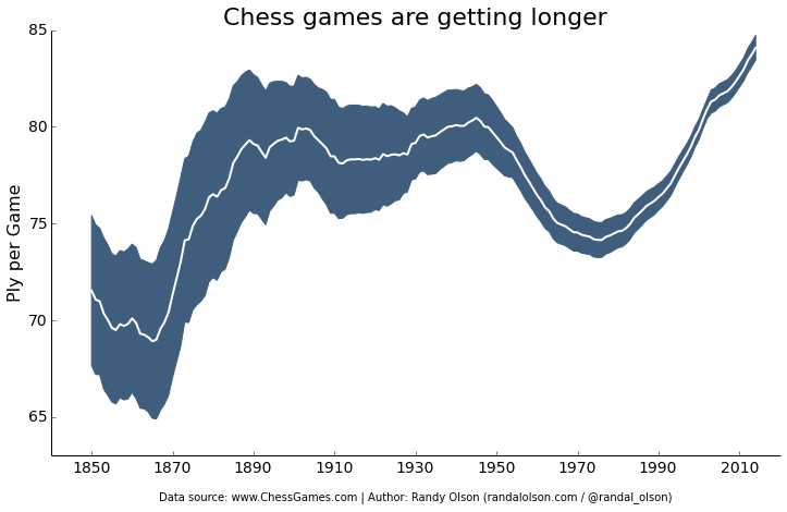
Some examples, with code, of color schemes and simplifying the plot display from Dr. Randal Olson
Original Blog Post: How to make beautiful data visualizations in Python with matplotlib
Authors: Dr. Randal Olson
Published: 2014-06-28
My summary:
What qualifies as a “beautiful” data visualization is certainly subjective. And, some may disagree with certain decisions made by the author of this post, like avoiding grid lines that could help guide the eye.
But, it is always helpful to have real coding examples of different plotting styles to use as inspiration or to incorporate into one’s own visualization code.
Here is the link again to their blog post for more details: How to make beautiful data visualizations in Python with matplotlib