Data Visualization Code and Packages
Data Visualization Code and Packages
Code Examples to Improve Data Visualizations
What makes a good plot is certainly subjective, but there are considerations that can make plots look more professional, as well as making them easier to read. All posts in this section include real code examples.
The first post here promotes the idea of “less is more” in creating visualizations, and even includes a gif that illustrates the effect of simplifying a standard bar chart. This post has Python/matplotlib code.
No matching items
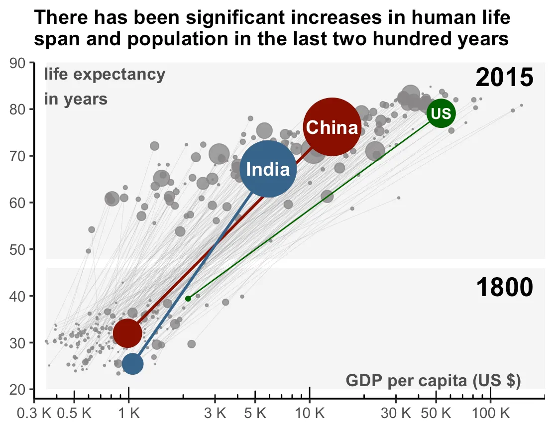
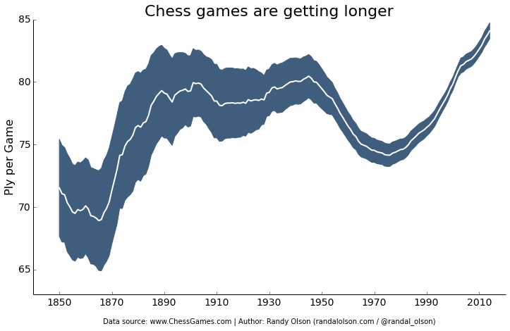
This next example uses R code to produce visualizations of data that changes with time. Some compare some metrics between two different time periods, while there is also an example of a traditional time series line graph.